bruno mars
$
bruno mars $
24k Magic website design
Web design + Social Properties
the website strategy
When we learned in early 2016 that Bruno Mars had a new album coming, my focus at Atlantic shifted entirely to his website. At that time, fans still relied on artist sites for key info, so this had to be the hub for tour dates, merch, and news and it needed to feel essential if you wanted to be part of Bruno’s world.
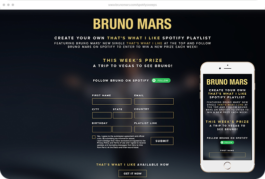
Every page pushed the mailing list front and center, with multiple sign-up spots promising first access to tickets, merch drops, and album updates. We layered in teasers, nostalgic content, and countdowns to keep people returning, but the real goal was to create a sense of VIP access. if you weren’t on the list, you felt like you were missing out.
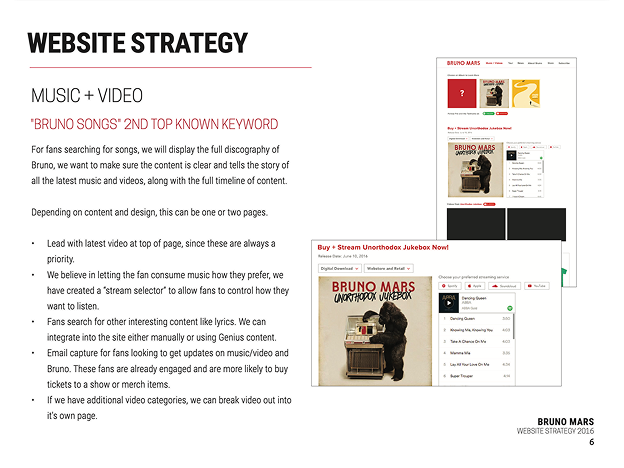
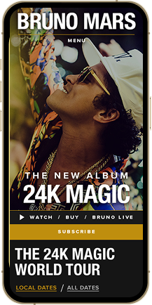
I made sure the design was clean, intuitive, and mobile-friendly, with depth in each section so scrolling felt like moving deeper into Bruno’s universe. My favorite piece was the music page. It showcased each of his three major releases, styled to match the look of each album. Even with different creative directions, the layout tied everything together and seamlessly ushered fans into the new 24K Magic era.
This video is an excellent critique on not only Bruno’s website, but artist sites in general at the time. It made me proud knowing our plan got across to fans and how other designers and marketers were looking to use the same methods we did for their websites :)


