cam

cam ☼

Branding | Art Direction | Design + Design Management | Physical Packaging | Tour Admat

all things light Album Creative

Close-up of the handwritten word 'CAM' in black ink
Text that reads 'All Things Light' in elegant cursive font.

the most personal rebrand

During the early days of the pandemic, while navigating the loneliness of new motherhood, Cam began writing songs to find a bit of peace. Those songs became a deep, honest reflection of what she was going through. As her daughter Lucy grew and started asking big questions about life and death, Cam felt inspired to go even deeper—creating a collection of songs filled with the lessons and light she hopes Lucy will carry with her. The package includes a letter to Lucy, and since she is such a vital part of this project, we decided to make Lucy’s handwriting Cam’s new logo. All song titles and numbers are handwritten.

A four-part collage with stylized text, a faceless woman in a suit, a smiling woman with blonde curly hair surrounded by miniature brick houses, and handwritten text on a dark background.
A vinyl record with a black label that reads 'Cam All Things Light' and other text around the edge, placed on a white and black circular background.
A woman with curly blonde hair in vintage clothing, standing in front of a lace backdrop on the left, and a close-up of the same woman on the right, in a studio setting.
Black and white image of a woman in a pinstripe suit with white bird silhouettes on her body, standing with her hands at her sides and curly hair. To her left, a wall displays lyrics of various songs in cursive and regular fonts.

Album Insert

Cam unboxing the vinyl

Black and white portrait of a woman with curly blonde hair, wearing a light-colored blouse with puffed sleeves.
Black and white portrait of a woman with curly hair wearing a blazer and shirt.

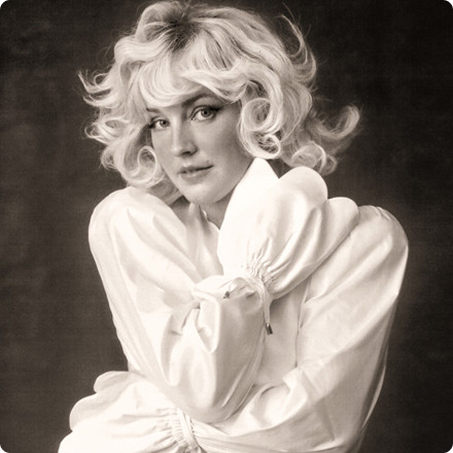
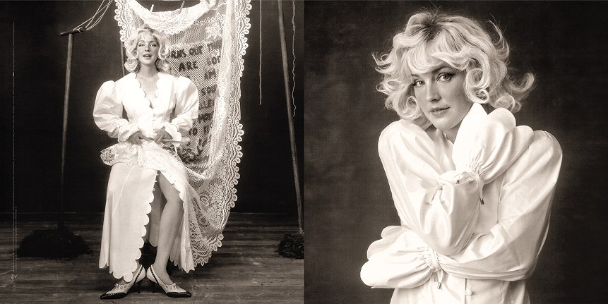
Single artwork for “Turns Out That I Am God” and “Everblue”

A woman with curly blonde hair and a serious expression lies against a dark background, wearing wooden miniature houses on her head. Text on the image describes the 'The Slow Down Tour' with dates and locations in the US and UK, and a website for tickets.

After the album was complete, Cam asked me to design her tour creative. The design came from the idea of light emulating from Cam herself to tie into the album concept. I hand wrote the numbers and the tour name.

Additional Credits:

Creative Direction: Cam
Photographer: Szilveszter Mako
Cover Design: Viktor Hammarberg
Branding and Package Design: Tonianne Tartaro
Logo by Cam’s daughter, Lucy